CSS Text
可以控制文字的屬性有color...等等。
以下介紹還沒提到的屬性
一、white-space
用來決定超過寬度的一行英文字之中,是否利用英文單字自動斷行,
其值有 normal (預設值)、nowrap、pre、pre-line、pre-wrap,
預設值是會自動斷行。
範例:
<!DOCTYPE html>
<html>
<head>
    <style>
        p {
            border: 1px solid red;
        }

        .nowrap {
            white-space: nowrap;
        }
    </style>
</head>
<body>
    <p class="nowrap">
        This is some text. This is some text. This is some text.
        This is some text. This is some text. This is some text.
        This is some text. This is some text. This is some text.
        This is some text. This is some text. This is some text.
    </p>
    <p>
        This is some text. This is some text. This is some text.
        This is some text. This is some text. This is some text.
        This is some text. This is some text. This is some text.
        This is some text. This is some text. This is some text.
    </p>
</body>
</html>
Tip:在中文字方面,每一個中文字都被視為單字。
二、word-wrap
用來決定超過寬度的一行英文字之中,針對超過寬度的一整組單字,
決定是否要強制斷行(被強制斷行的該組單字會先跳一行),
word-wrap提供的樣式值為normal(預設值)、break-word,
預設值是不會強制斷行。
<!DOCTYPE html>
<html>
<head>
    <style>
        p {
            width: 11em;
            border: 1px solid #000000;
        }

        .white-space-normal {
            white-space: normal;
        }

        .white-space-nowrap {
            white-space: nowrap;
        }

        .word-wrap-break-word {
            word-wrap: break-word;
        }

        .word-wrap-normal {
            word-wrap: normal;
        }
    </style>
</head>
<body>
    <p class="white-space-normal"> This paragraph contains a very long word: thisisaveryveryveryveryveryverylongword. The long word will break and wrap to the next line.</p>
    <p class="white-space-nowrap"> This paragraph contains a very long word: thisisaveryveryveryveryveryverylongword. The long word will break and wrap to the next line.</p>

    <p class="word-wrap-break-word"> This paragraph contains a very long word: thisisaveryveryveryveryveryverylongword. The long word will break and wrap to the next line.</p>
    <p class="word-wrap-normal"> This paragraph contains a very long word: thisisaveryveryveryveryveryverylongword. The long word will break and wrap to the next line.</p>
</body>
</html>
三、word-break
用來決定超過寬度的一行英文字之中,針對超過寬度的一整組單字,決定是否要強制斷行。
其值有 normal (預設值,此時 white-space 值為單字自動斷行,word-wrap 值不為強制斷行)、
keep-all、break-word、break-all。
其餘說明如下:
keep-all 在不考慮中文字之下,keep-all 效果等於 normal。
break-word 其效果等於同時具有 white-space : normal; 與 word-wrap : break-word; 特性
break-all 表示除了有 white-space : normal; 特性之外,
還具有強制斷行的效果(不用再考慮強制斷行的該組單字會先跳一行,跟 word-wrap : break-word; 有點不太一樣)。
<!DOCTYPE html>
<html>
<head>
    <style>
        p {
            width: 11em;
            border: 1px solid #000000;
        }

        .white-space-normal {
            white-space: normal;
        }

        .white-space-nowrap {
            white-space: nowrap;
        }

        .word-wrap-break-word {
            word-wrap: break-word;
        }

        .word-wrap-normal {
            word-wrap: normal;
        }

        .word-break-normal {
            word-break: normal;
        }

        .word-break-keep-all {
            word-break: keep-all;
        }

        .word-break-break-word {
            word-break: break-word;
        }

        .word-break-break-all {
            word-break: break-all;
        }
    </style>
</head>
<body>
    <p class="white-space-normal"> This paragraph contains a very long word: thisisaveryveryveryveryveryverylongword. The long word will break and wrap to the next line.</p>
    <p class="white-space-nowrap"> This paragraph contains a very long word: thisisaveryveryveryveryveryverylongword. The long word will break and wrap to the next line.</p>

    <p class="word-wrap-break-word"> This paragraph contains a very long word: thisisaveryveryveryveryveryverylongword. The long word will break and wrap to the next line.</p>
    <p class="word-wrap-normal"> This paragraph contains a very long word: thisisaveryveryveryveryveryverylongword. The long word will break and wrap to the next line.</p>

    <hr />
    <p class="word-break-normal"> This paragraph contains a very long word: thisisaveryveryveryveryveryverylongword. The long word will break and wrap to the next line.</p>
    <p class="word-break-keep-all"> This paragraph contains a very long word: thisisaveryveryveryveryveryverylongword. The long word will break and wrap to the next line.</p>
    <p class="word-break-break-word"> This paragraph contains a very long word: thisisaveryveryveryveryveryverylongword. The long word will break and wrap to the next line.</p>
    <p class="word-break-break-all"> This paragraph contains a very long word: thisisaveryveryveryveryveryverylongword. The long word will break and wrap to the next line.</p>
</body>
</html>
四、text-overflow
在 overflow : hidden; 之下,當超過寬度的一行英文字之中,
text-overflow 屬性將用來決定刪文樣式。
text-overflow 提供的樣式值為clip(預設值)、ellipsis,
而 overflow 提供的樣式值為visible(預設值)、hidden、scroll、auto
範例如下
<!DOCTYPE html>
<html>
<head>
    <style>
        p {
            width: 11em;
            border: 1px solid #000000;
        }

        .white-space-normal {
            white-space: normal;
            overflow: hidden;
            text-overflow: ellipsis;
        }

        .white-space-nowrap {
            white-space: nowrap;
            overflow: hidden;
            text-overflow: ellipsis;
        }

        .word-wrap-break-word {
            word-wrap: break-word;
            overflow: hidden;
            text-overflow: ellipsis;
        }

        .word-wrap-normal {
            word-wrap: normal;
            overflow: hidden;
            text-overflow: ellipsis;
        }
    </style>
</head>
<body>
    <p class="white-space-normal"> This paragraph contains a very long word: thisisaveryveryveryveryveryverylongword. The long word will break and wrap to the next line.</p>
    <p class="white-space-nowrap"> This paragraph contains a very long word: thisisaveryveryveryveryveryverylongword. The long word will break and wrap to the next line.</p>

    <p class="word-wrap-break-word"> This paragraph contains a very long word: thisisaveryveryveryveryveryverylongword. The long word will break and wrap to the next line.</p>
    <p class="word-wrap-normal"> This paragraph contains a very long word: thisisaveryveryveryveryveryverylongword. The long word will break and wrap to the next line.</p>
</body>
</html>
五、text-indent
用來指定一個句子第一行的縮排
<!DOCTYPE html>
<html>
<head>
    <style>
        p {
            text-indent: 1em;
        }
    </style>
</head>
<body>
    <p>
        Ins my younger and more vulnerable years my father gave me,
        In my younger and more vulnerable years my father gave me,
        In my younger and more vulnerable years my father gave me,
        In my younger and more vulnerable years my father gave me
    </p>
</body>
</html>
通常使用 text-indent 時會使用em單位,而不會使用px單位,
關於em的用法請參考CSS教學-段落文字縮排、凸排設定
範例:利用 text-indent 等屬性來做文字隱藏效果
<!DOCTYPE html>
<html>
<head>
    <style>
        p {
            white-space: nowrap;
            text-indent: 100%;
            overflow: hidden;
        }
    </style>
</head>
<body>

    <p>
        Ins my younger and more vulnerable years my father gave me,
        In my younger and more vulnerable years my father gave me,
        In my younger and more vulnerable years my father gave me,
        In my younger and more vulnerable years my father gave me
    </p>

</body>
</html>
六、line-height
指定行跟行之間的間距,可為單位長度或百分比
<!DOCTYPE html>
<html>
<head>
    <style>
        p.small {
            line-height: 70%;
        }

        p.big {
            line-height: 200%;
        }
    </style>
</head>
<body>

    <p>
        This is a paragraph with a standard line-height.<br>
        This is a paragraph with a standard line-height.<br>
        The default line height in most browsers is about 110% to 120%.<br>
    </p>

    <p class="small">
        This is a paragraph with a smaller line-height.<br>
        This is a paragraph with a smaller line-height.<br>
        This is a paragraph with a smaller line-height.<br>
        This is a paragraph with a smaller line-height.<br>
    </p>

    <p class="big">
        This is a paragraph with a bigger line-height.<br>
        This is a paragraph with a bigger line-height.<br>
        This is a paragraph with a bigger line-height.<br>
        This is a paragraph with a bigger line-height.<br>
    </p>

</body>
</html>
七、text-align
用來控制塊級元素裡的子元素一行中的文字是靠左還靠右、置中、平均分散,
預設當然是靠左,有四種樣式分別為left、right、center、justify
範例:
<!DOCTYPE html>
<html>
<head>
    <style>
        h1 {
            text-align: center;
        }
    </style>
</head>
<body>
    <h1>CSS text-align Example</h1>
</body>
</html>
再看一個例子,
ul tag 是塊級元素,li tag 由塊級元素轉變為行內元素 ( inline-block),
藉由在塊級元素上指定 text-align 屬性將會影響到裡面行內元素的水平排列方式。
<!DOCTYPE html>
<html>
<head>
    <meta charset="utf-8">
    <meta name="viewport" content="width=device-width">
    <style>
        ul {
            border: 1px solid blue;
            padding: 0;
            text-align: center;
        }

            ul > li {
                border: 1px solid red;
                list-style-type: none;
                display: inline-block;
            }
    </style>
</head>
<body>
    <ul>
        <li class="menu1">a</li>
        <li class="menu2">b</li>
        <li class="menu3">c</li>
    </ul>
</body>
</html>
八、vertical-align
決定行內元素( inline、inline-block )往上擺或往下擺或置中,常用在文字垂直置中。
可用的值有 top、middle、bottom、baseline、super、sub、text-top、text-bottom、px、%
範例:
<!DOCTYPE html>
<html>
<head>
    <meta charset="utf-8">
    <meta name="viewport" content="width=device-width">
    <style>
        div {
            border: 1px solid red;
            padding: 10px;
            line-height: 700%;
        }

        img {
            border: 1px solid blue;
        }

        .top {
            vertical-align: top;
        }

        .middle {
            vertical-align: middle;
        }

        .bottom {
            vertical-align: bottom;
        }

        .baseline {
            vertical-align: baseline;
        }

        .super {
            vertical-align: super;
        }

        .sub {
            vertical-align: sub;
        }

        .text-top {
            vertical-align: text-top;
        }

        .text-bottom {
            vertical-align: text-bottom;
        }
    </style>
</head>

<body>
    <div>An <img class="top" src="https://mdn.mozillademos.org/files/12245/frame_image.svg" alt="link" width="32" height="32" /> image with a top alignment.</div>

    <div>An <img class="middle" src="https://mdn.mozillademos.org/files/12245/frame_image.svg" alt="link" width="32" height="32" /> image with a middle alignment.</div>

    <div>An <img class="bottom" src="https://mdn.mozillademos.org/files/12245/frame_image.svg" alt="link" width="32" height="32" /> image with a bottom alignment.</div>

    <div>An <img class="baseline" src="https://mdn.mozillademos.org/files/12245/frame_image.svg" alt="link" width="32" height="32" /> image with a baseline alignment.</div>

    <div>An <img class="super" src="https://mdn.mozillademos.org/files/12245/frame_image.svg" alt="link" width="32" height="32" /> image with a super alignment.</div>

    <div>An <img class="sub" src="https://mdn.mozillademos.org/files/12245/frame_image.svg" alt="link" width="32" height="32" /> image with a sub alignment.</div>

    <div>An <img class="text-top" src="https://mdn.mozillademos.org/files/12245/frame_image.svg" alt="link" width="32" height="32" /> image with a text-top alignment.</div>

    <div>An <img class="text-bottom" src="https://mdn.mozillademos.org/files/12245/frame_image.svg" alt="link" width="32" height="32" /> image with a text-bottom alignment.</div>
</body>
</html>
結果如下圖
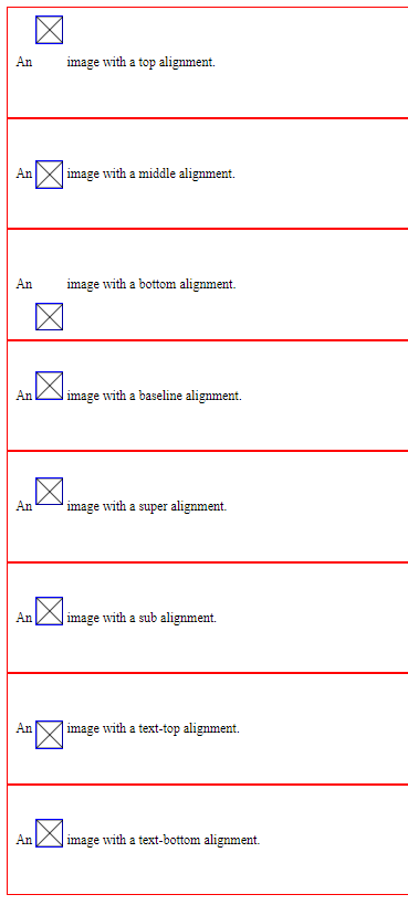
注意,在使用 vertical-align 時,請把 line-height 給撐大一點,
vertical-align 的特性才得以發揮出來。
另一例子將明顯示出 vertical-align : middle ,是指在一父元素內的所有子元素垂直位置互相置中
<!DOCTYPE html> <html> <head> <meta charset="utf-8"> <meta name="viewport" content="width=device-width"> <style> .div0 { width: 200px; height: 150px; border: 1px solid #000; text-align: center; } .redbox { width: 30px; height: 30px; background: #c00; display: inline-block; vertical-align: middle; line-height: 30px; } .greenbox { width: 30px; height: 60px; background: #0c0; display: inline-block; vertical-align: middle; line-height: 60px; } .yellowbox { width: 30px; height: 40px; background: #F1E500; display: inline-block; vertical-align: middle; line-height: 40px; } </style></head>
<body>
<div class="div0">
<div class="redbox">a</div>
<div class="greenbox">b</div>
<div class="yellowbox">c</div>
</div>
</body>
</html>
九、text-decoration
用來對文字加上底線、下底線、刪除線的樣式
值可為overline、underline、line-through、none
範例:
<!DOCTYPE html>
<html>
<head>
    <style>
        h1 {
            text-decoration: overline;
        }

        h2 {
            text-decoration: line-through;
        }

        h3 {
            text-decoration: underline;
        }
    </style>
</head>
<body>

    <h1>This is heading 1</h1>
    <h2>This is heading 2</h2>
    <h3>This is heading 3</h3>

</body>
</html>
十、text-transform
用來表示英文字母要大小寫還是每個字母大寫,值可為
uppercase、lowercase、capitalize
範例:
<!DOCTYPE html>
<html>
<head>
    <style>
        h1 {
            text-transform: uppercase;
        }

        h2 {
            text-transform: lowercase;
        }

        h3 {
            text-transform: capitalize;
        }
    </style>
</head>
<body>

    <h1>This is heading 1</h1>
    <h2>This is heading 2</h2>
    <h3>This is heading 3</h3>

</body>
</html>
十一、letter-spacing
指定每一個字母的間距
<!DOCTYPE html>
<html>
<head>
    <style>
        h1 {
            letter-spacing: 2px;
        }

        h2 {
            letter-spacing: -3px;
        }
    </style>
</head>
<body>

    <h1>This is heading 1</h1>
    <h2>This is heading 2</h2>

</body>
</html>
十二、word-spacing
設定每一個單字間的空白間格距離
範例:
<!DOCTYPE html>
<html>
<head>
<style>
p {
    word-spacing: 30px;
}
</style>
</head>
<body>

<p>
This is some text. This is some text.
</p>

</body>
</html>
十三、text-shadow
用來對字型增加陰影,文法格式為
text-shadow: h-shadow v-shadow blur-radius color,
而且還可以增加一組以上的特效。
範例1:
<!DOCTYPE html>
<html>
<head>
    <style>
        h1 {
            text-shadow: 2px 2px 8px #FF0000;
        }
    </style>
</head>
<body>

    <h1>Text-shadow with blur effect</h1>

    <p><b>Note:</b> Internet Explorer 9 and earlier do not support the text-shadow property.</p>

</body>
</html>
範例2:
<!DOCTYPE html>
<html>
<head>
    <style>
        h1 {
            text-shadow: 0 0 3px #FF0000, 0 0 50px #0000FF;
        }
    </style>
</head>
<body>

    <h1>Text-shadow with red and blue neon glow</h1>

    <p><b>Note:</b> Internet Explorer 9 and earlier do not support the text-shadow property.</p>

</body>
</html>
十四、box-shadow
其用法跟text-shadow差不多,功能為對元素外框加陰影
範例:
<!DOCTYPE html>
<html>
<head>
    <style>
        span {
            text-shadow: 2px 2px 8px #FF0000;
            box-shadow: 10px 10px;
        }

        div {
            width: 300px;
            height: 100px;
            padding: 15px;
            background-color: yellow;
            box-shadow: 10px 10px;
            text-shadow: 2px 2px 8px #FF0000;
        }
    </style>
</head>
<body>

    <h1>Text-shadow with <span>blur</span> effect</h1>

    <p><b>Note:</b> Internet Explorer 9 and earlier do not support the text-shadow property.</p>
    <div>This is a div element with a box-shadow</div>
</body>
</html>
參考資料: